The "Prowler" Volume 33's "We Know Now" theme reflects the transition to a post-COVID era. The theme encompasses the knowledge the students of 2022 have learned from all the intricacies and obstacles of the COVID-19 pandemic. It highlights that students know now that normal is complicated, challenge has rewards, and together is better.
For this volume of the Yearbook, I was responsible for overseeing the visual aspect of the Yearbook as the editor-in-chief of design. I directed the production of this volume's style guide, created spread templates, guided new and experienced classmates in regards to working with InDesign and the year's style sheet, and of course, designed and revised numerous pages of the 300+ page publication.
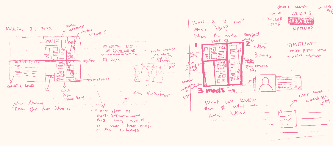
Brainstorming
Upon finding our year's voice in our theme statement "We Know Now", I helped progress our team to our next step: visualizing the voice of our book through a style guide.
The design of this volume centered around a tone of boldness, maturity, and sophistication; qualities that we felt matched the thematic statement of knowing better and knowing more.
In our months-long search for inspiration, we came across Kobe Bryant's "The Mamba Mentality: How I Play". Designed by Nick Steinhardt, and with his permission, this book became a primary source of inspiration for the yearbook's visual aspect.

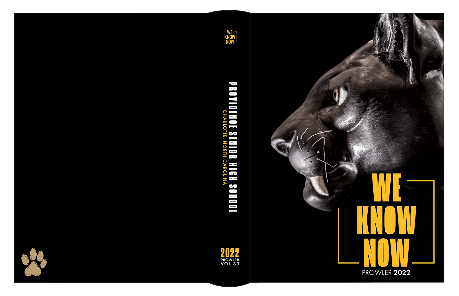
Cover
Steinhardt's cover design on "The Mamba Mentality" brought light to the idea of emphasizing the mascot of Providence High School: the black panther.
Captured by Ethan Rand, the book's cover features a close-up shot of one of the two panther statues in the school's entrance hall. The scratches on the panther express the sense of maturity and age, connecting to the theme of new understanding.
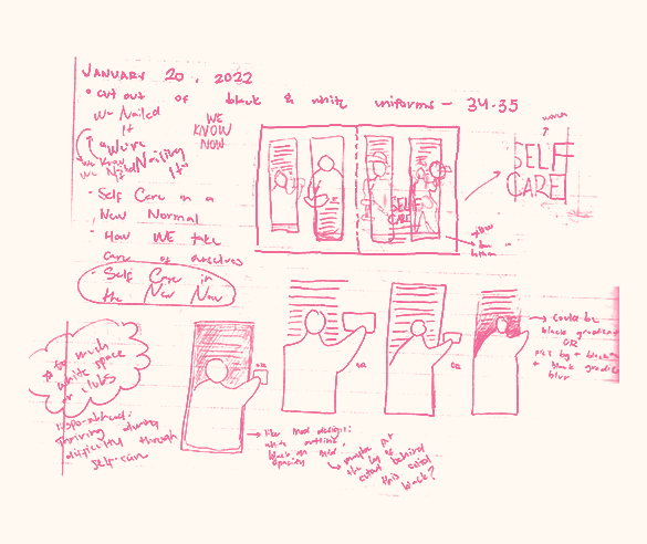
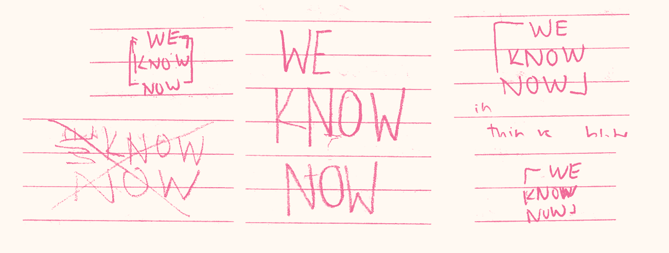
The logomark featured on the cover introduces the design elements employed throughout the book. The broken outline of the box surrounding the text "We Know Now" references breaking out of the confining boundaries present during the COVID-19 pandemic. It represents breaking out of our barriers and reaching for something new and unfamiliar.
The logomark featured on the cover introduces the design elements employed throughout the book. The broken outline of the box surrounding the text "We Know Now" references breaking out of the confining boundaries present during the COVID-19 pandemic. It represents breaking out of our barriers and reaching for something new and unfamiliar.
As opposed to its predecessors, this volume uses a limited color palette of black, white, gray, and yellow. It echoes the school's color palette of gold and black, and although previous yearbooks often used varying colors throughout their pages, unique and dependent on a page's dominant picture, the style choice of limiting all the pages to this limited color palette unified all the pages under one color scheme.
Endsheets
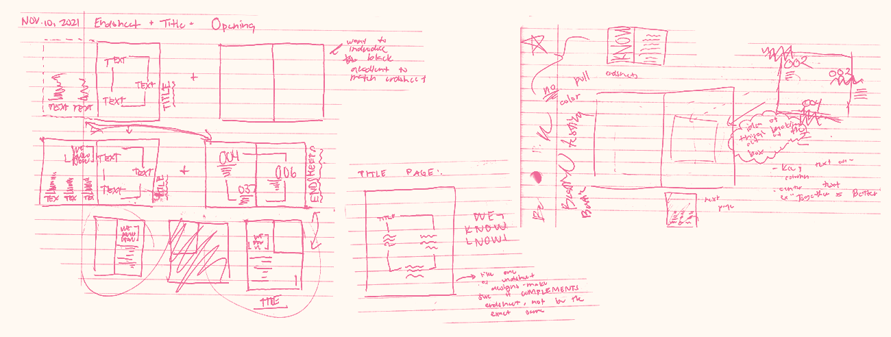
"We Know Now" presents a unique take on the traditional table of contents and the title page. The book's title page extends to two pages—as opposed to the singular page—to maximize space, incorporate more of the visual design elements, and give the table of contents room to breathe.

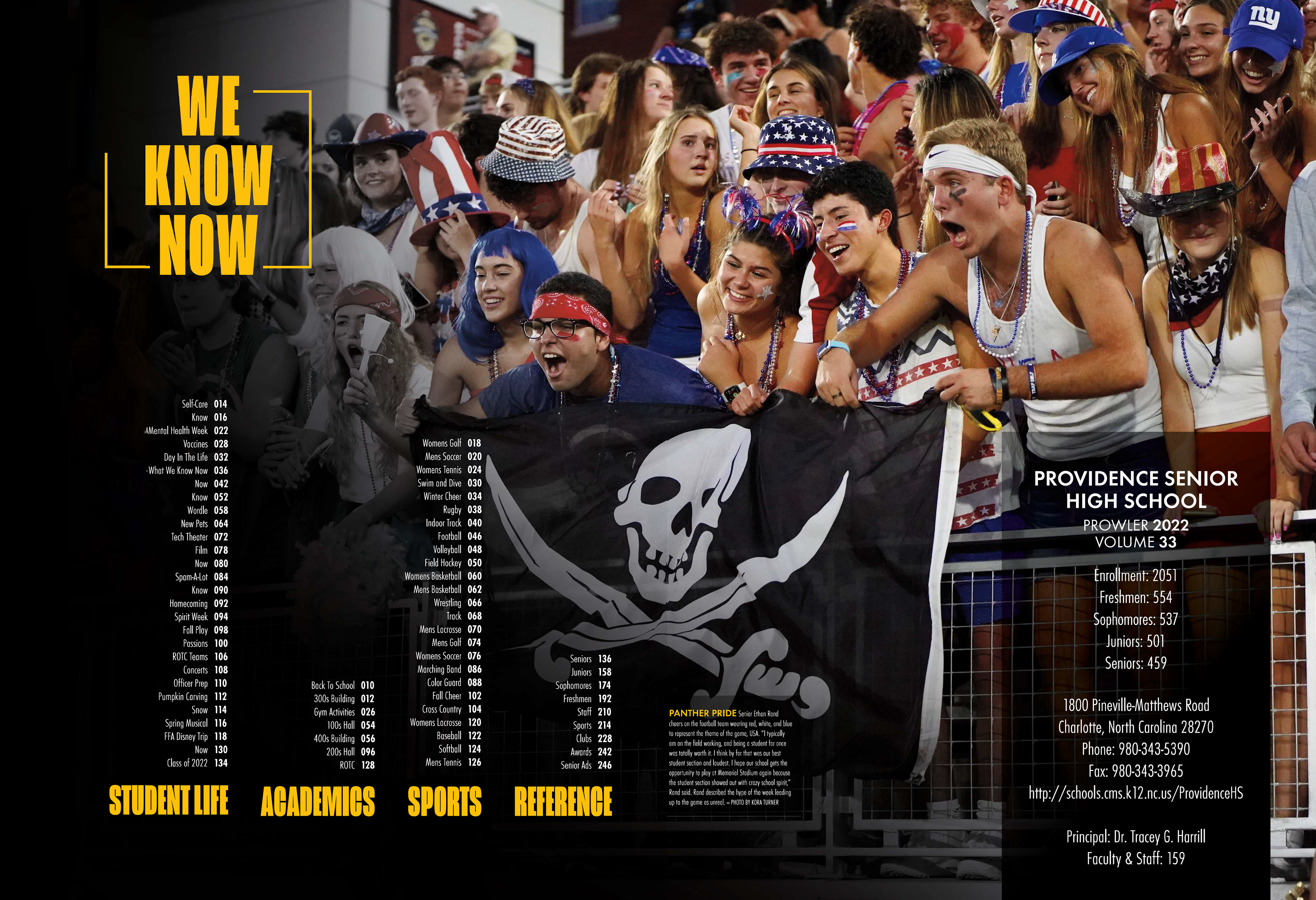
The book organizes its pages in two separate ways. The one across the title page is the traditional index, which organizes the pages into general sections (student life, academics, sports, and reference). On the other hand, the endsheet organizes the pages in relation to the theme (normal is complicated, challenge has rewards, and together is better).
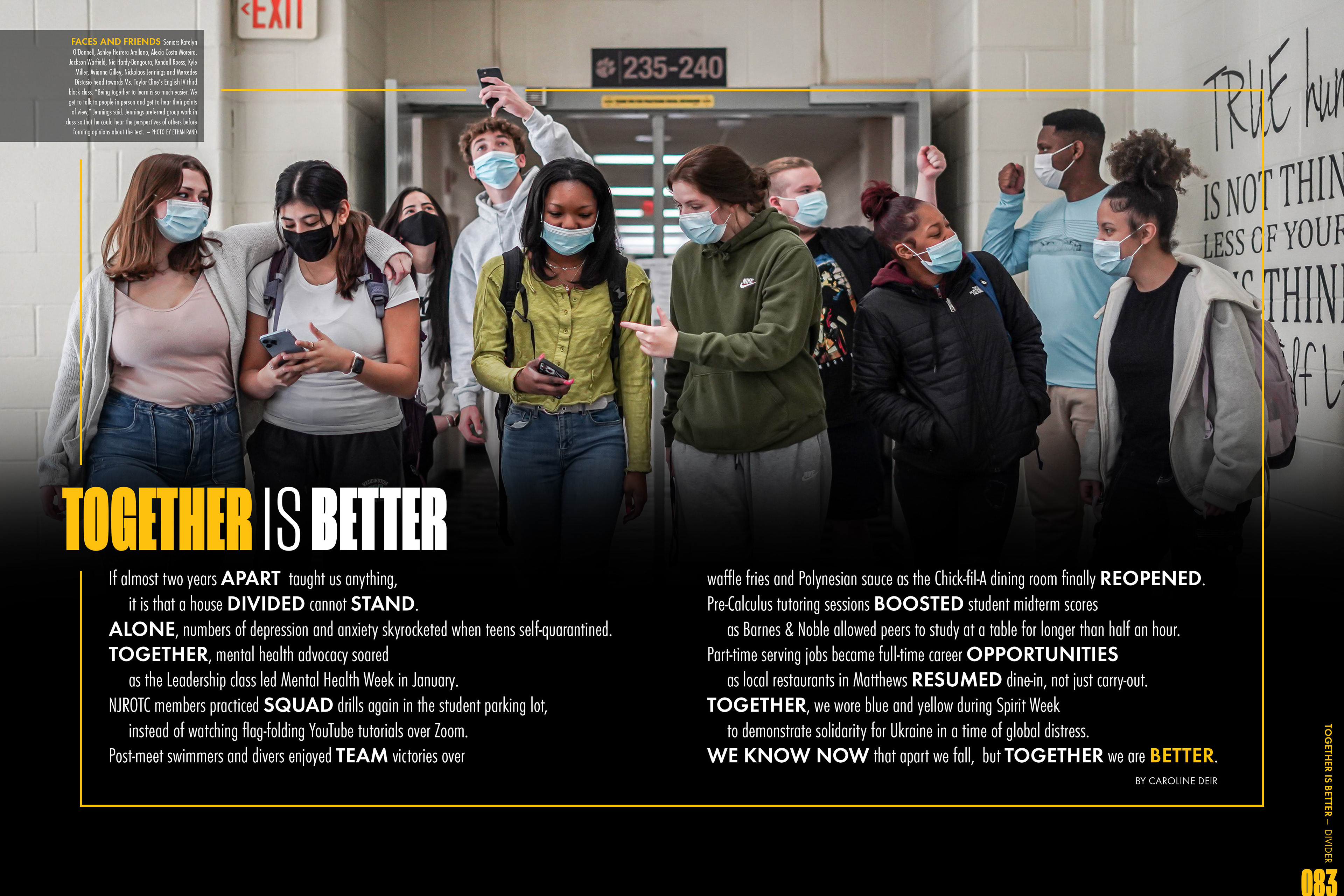
Opening + Dividers
The three-page opening of the book alternatively uses selective color to bring emphasis to the subject, as well as continue the black-and-white theme portrayed on the cover. Expressive typography—on top of a black linear gradient—is consistently used to add emphasis to certain words with heavier significance.


Features
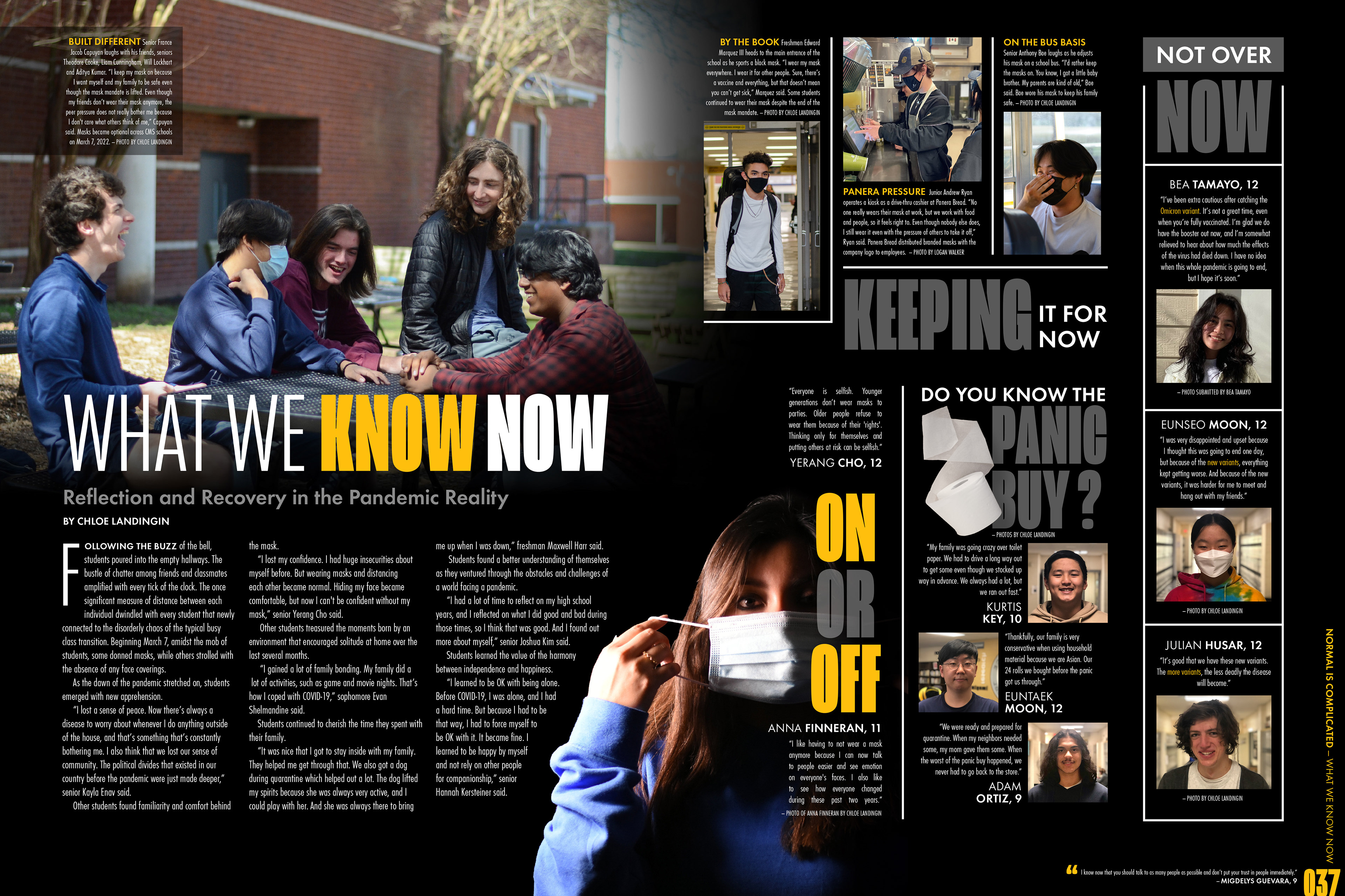
A feature spread consists of a student-life subject and a design unique to the two pages. These pages do not follow a template, giving the designer more freedom to create a composition that better fits the subject of the page.
Quad Mods
Athlete Spotlight
Redesign
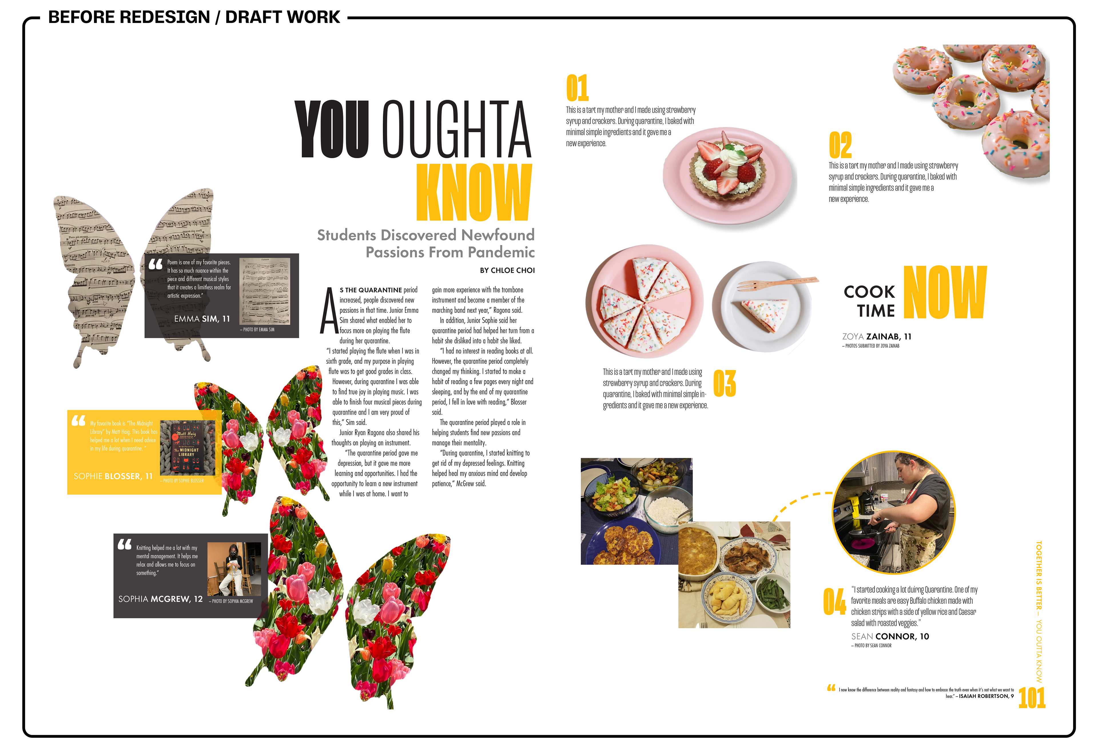
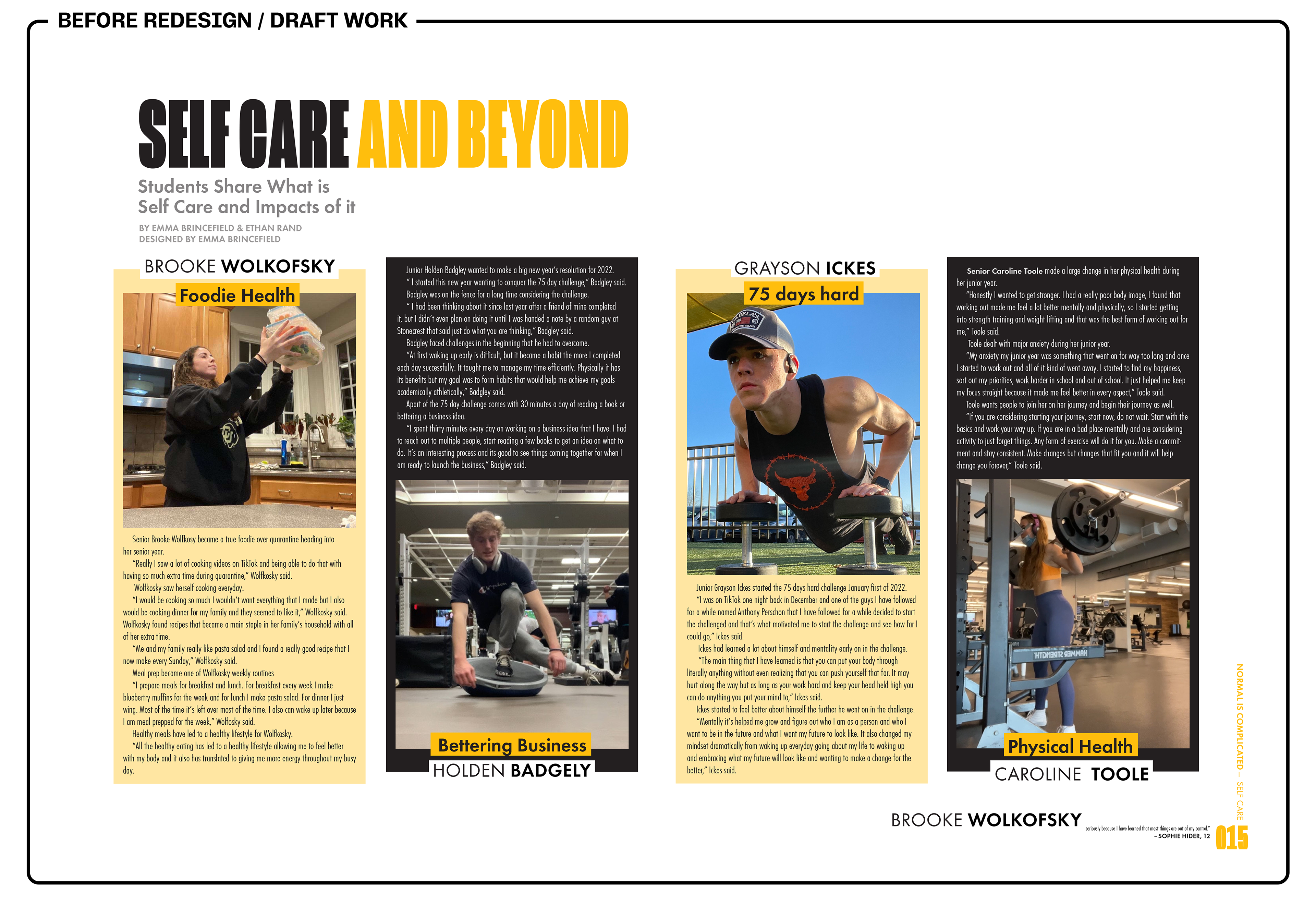
As editor-in-chief of design, I supervised the team of designers from this year's staff. Though I held experience in design, assuming the role of a leader was a new challenge I faced. Met with the challenge of tight deadlines, my experience at the beginning of production was a constant struggle between balancing my time designing assets and templates with teaching the design team the foundations of yearbook design.
Although redesigning was a constant effort at the beginning of the year, over time, the design team—though they were new to yearbook design—grew to be able to hold their own, and their designs called for a lot less drastic redesign.